
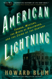
This is a great example of how branding can work for artist recognition. Simply based on imagery I assumed the book was of Eric Larson's work. Also, an example of how others can capitalize on someone else's branding, lending to themselves the original creator's reputation. Even after realizing my mistake I still thought it sounded like a good book.
It could also be a case of a snap reaction from me and the designer/publisher had no intention of any kind of tie in but non-the-less the design got me to pick up the book.
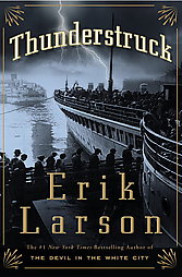
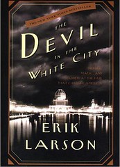
Eric Larson's popular historical, true crime books have similar covers which build a visual recognition for readers.
Howard Blum's cover has similar qualities; book title on arch and angle, long subtitle, large monotone location shots as the imagery.
2 What do you think?:
Love the new look of your blog and your postings! You inspire me to do more with mine ... here's to a creative 2009 for us both!
Thank you, i'm actually looking to update it again soon. Yes, indeed, here's to a creative '09!
Post a Comment